
InTent is an online camping supply store. The users are from all ages and genders, and are outdoor and/or camping enthusiasts. InTent’s goal is to make shopping for camping supply easy and accessible to all age groups and camping experience levels.
2024
Responsive Camping Supply Website
Rolle: UX-Research, UX-/UI-Design
Projekttyp: Projekt im Google UX Kurs
Dauer: 1 Monat
InTent
USER RESEARCH
I conducted user interviews, which I then turned into empathy maps to better understand the target user and their needs. I discovered that many users need guidance to find the camping products that they need, because there are too many products to choose from. Many online camping supply store do not have said guidance system and some are not accessible to users with visual impairment.
Online camping supply stores often have a big product range, and no help what to buy besides product descriptions.
Camping supply store website designs are often busy, which results in confusing navigation.
Camping supply store websites don’t provide an engaging browsing experience and are not always accessible.
1
2
3
PAIN POINTS
PAIN POINTS
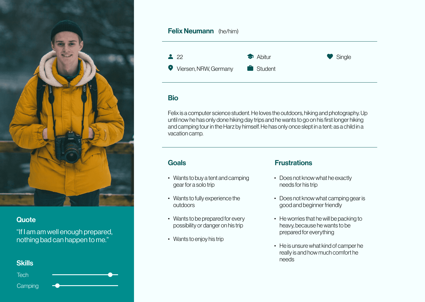
Felix is a first time camper who needs help choosing the right camping gear for him
because he does not know much about camping.
Felix is a first time camper who needs help choosing the right camping gear for him because he does not know much about camping.
Hans is a retiree who needs help finding camping gear because she wants to enjoy his retirement with his wife camping and enjoying the world.

Personas
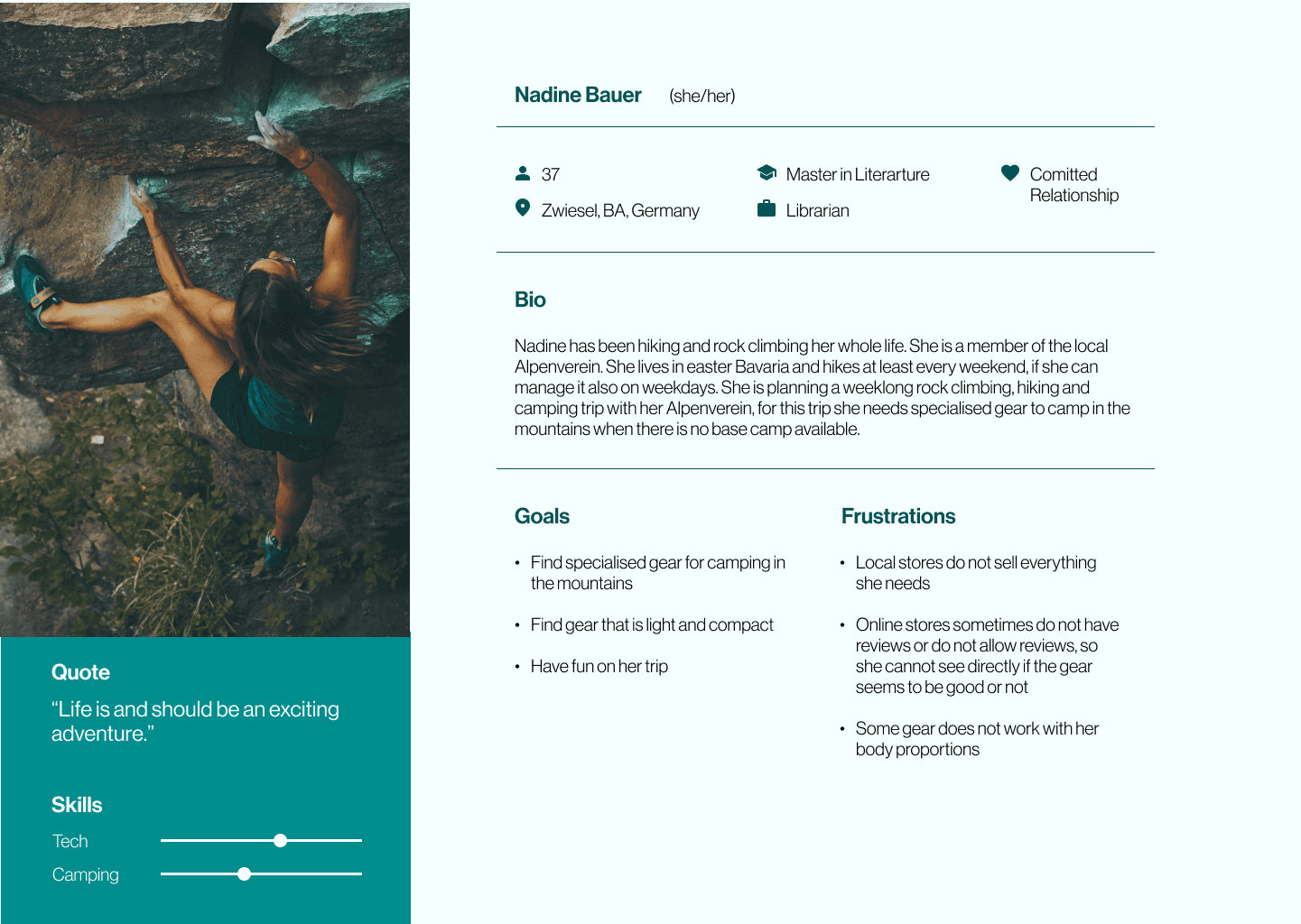
Nadine is a rock climber who needs to find light and robust camping gear because she wants to go camping in the mountains.
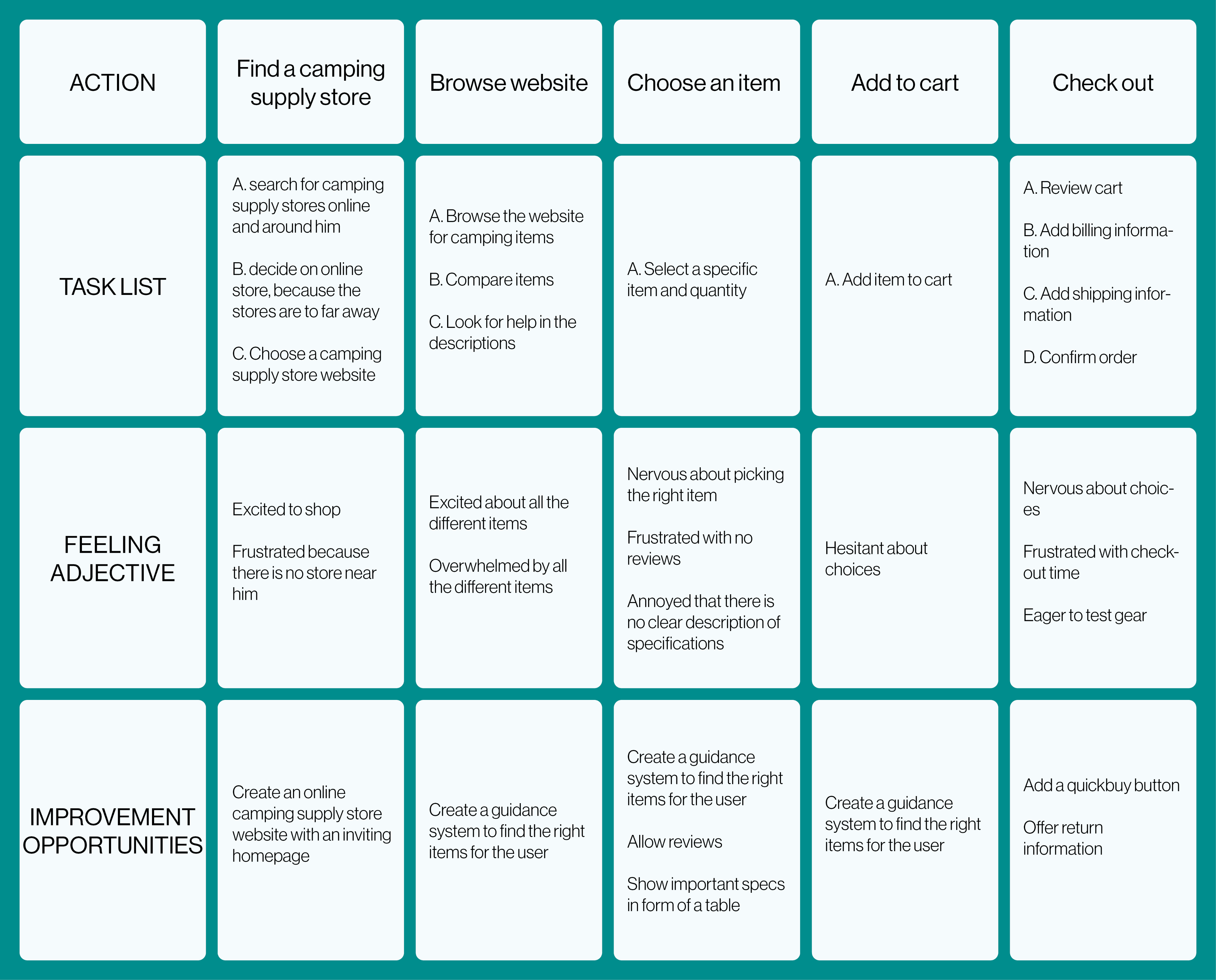
USER JOURNEY MAP
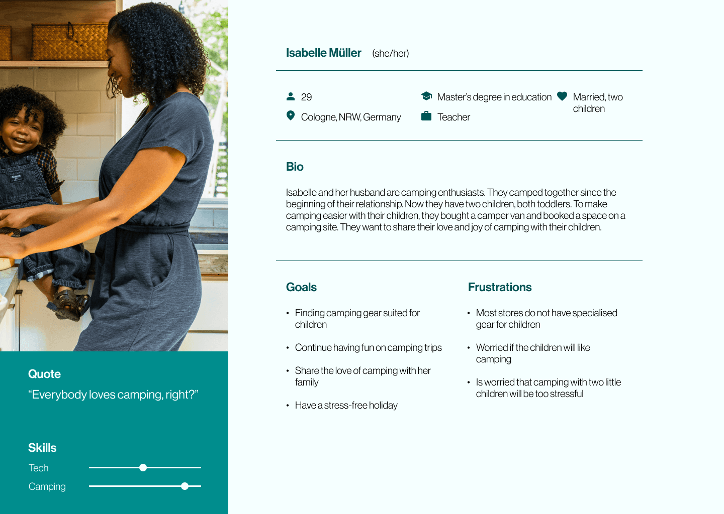
Isabelle is a mother who needs to find camping gear for children because she wants to take her two toddlers on their first camping trip.
Nadine is a rock climber who needs to find light and robust camping gear because she wants to go camping in the mountains.
IDeation
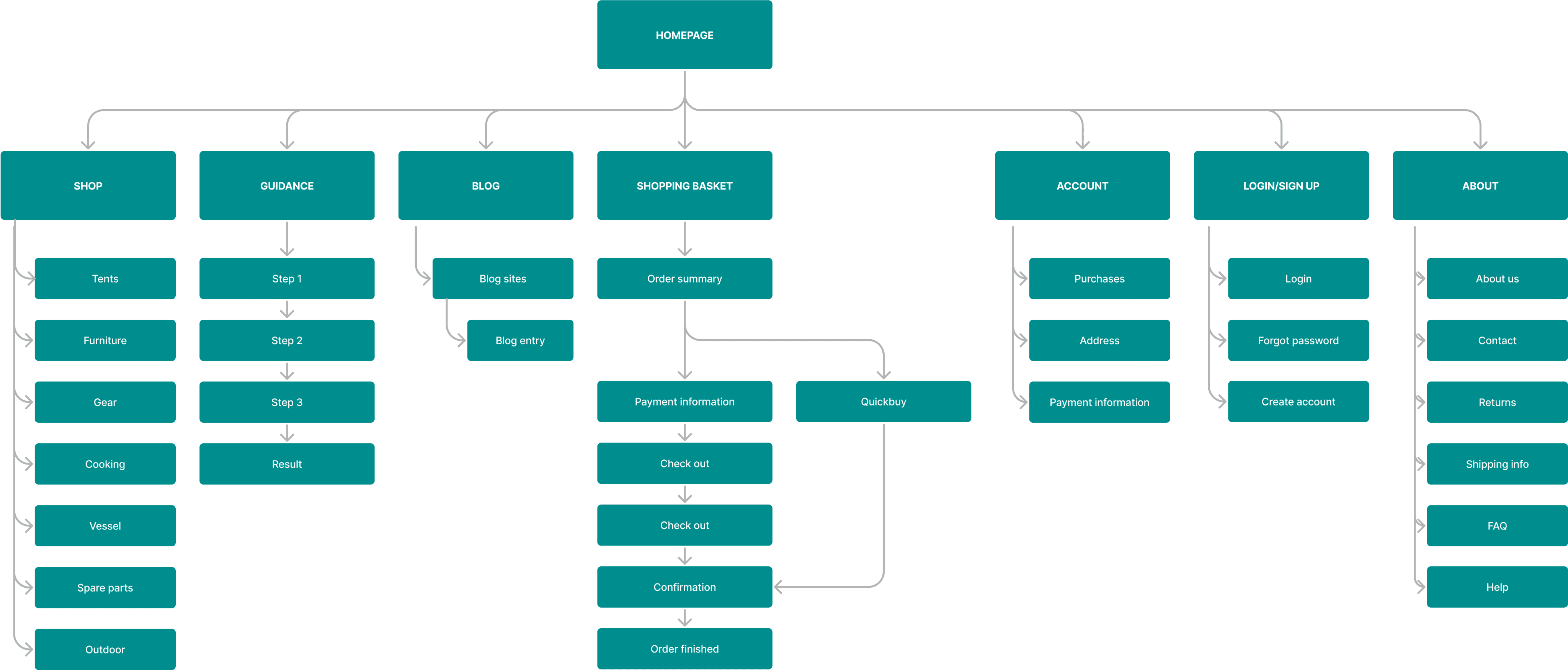
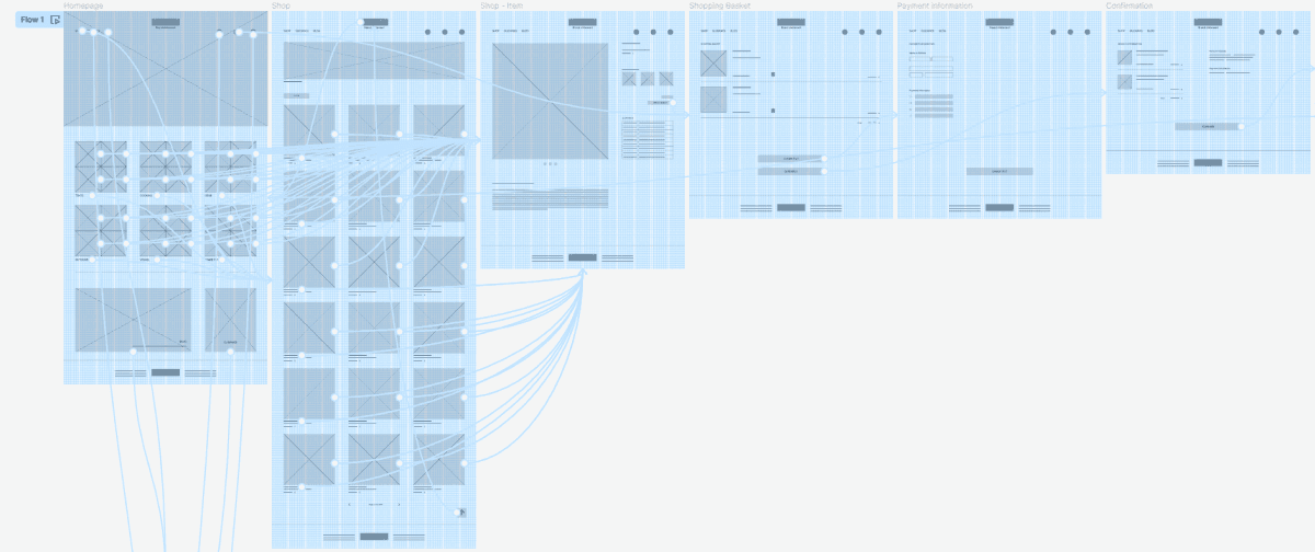
Needing guidance was a primary pain point for users, so I implemented a guidance system in the site map. Another pain point was difficulty with website navigation so I used that knowledge to create a sitemap.
My goal here was to make strategic information architecture decisions that would improve overall website navigation. The structure I chose was designed to make things simple and easy.
SITEMAP

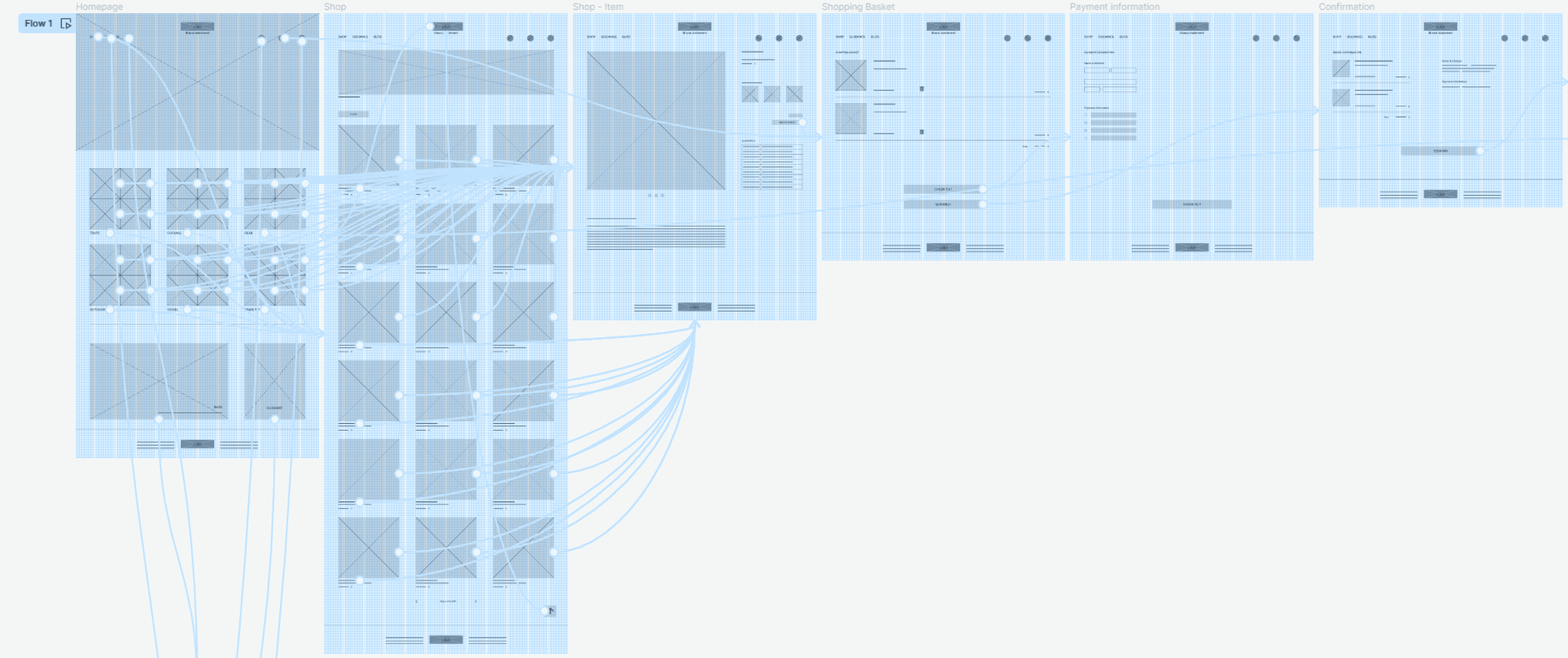
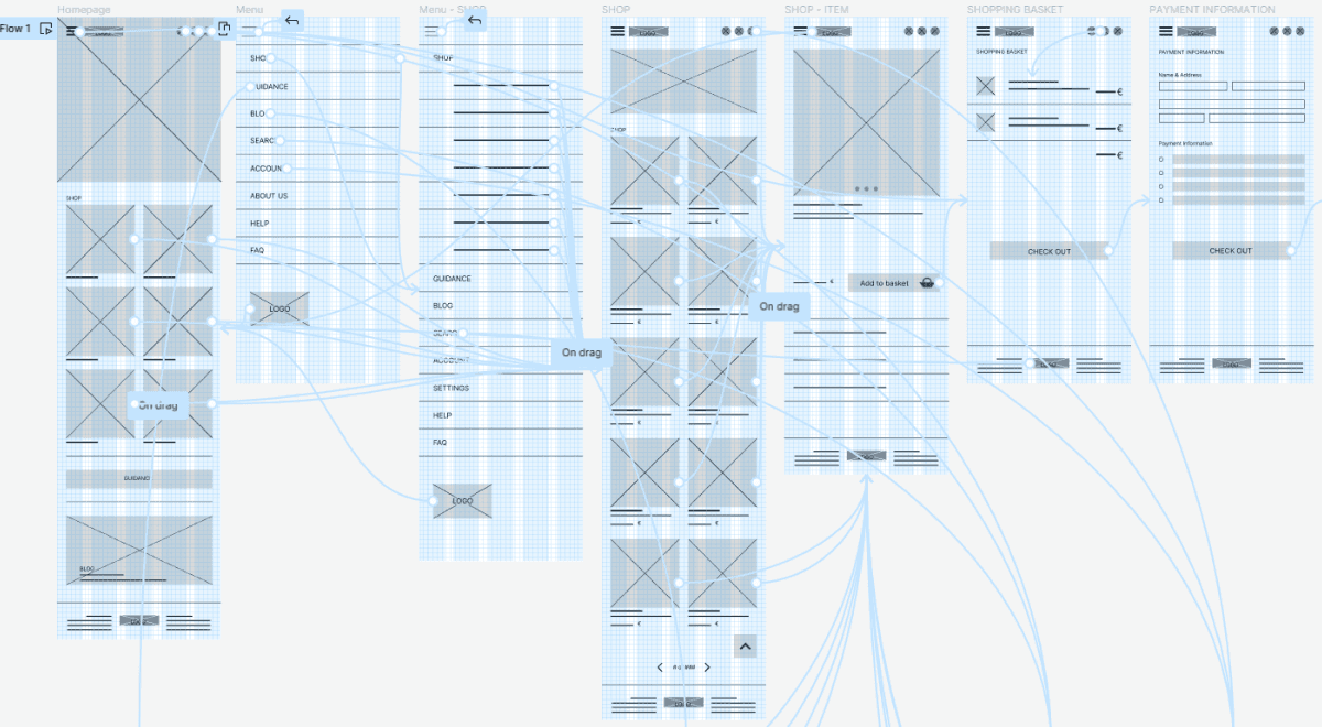
Digital wireframes

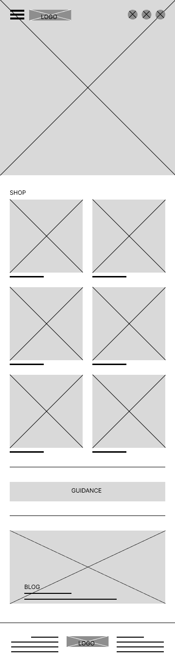
Short menu to simplify navigation
Uncluttered homepage to not feel overwhelmed
Shop categories with most liked items to easy find category
Blog and guidance system at the end to have a second option to open them
Hamburger menu to save space
IDEATION
SITEMAP
Needing guidance was a primary pain point for users, so I implemented a guidance system in the site map. Another pain point was difficulty with website navigation so I used that knowledge to create a sitemap.
My goal here was to make strategic information architecture decisions that would improve overall website navigation. The structure I chose was designed to make things simple and easy.
Paper Wireframes
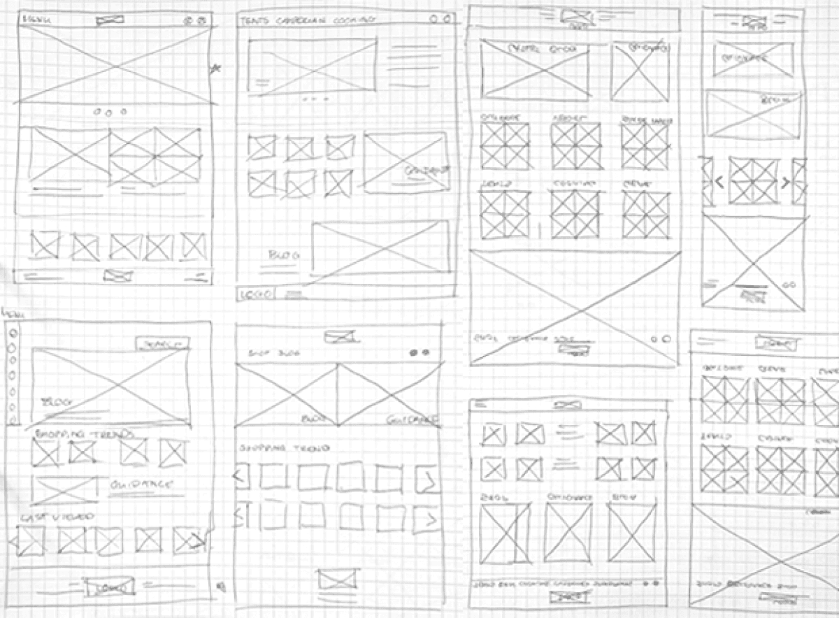
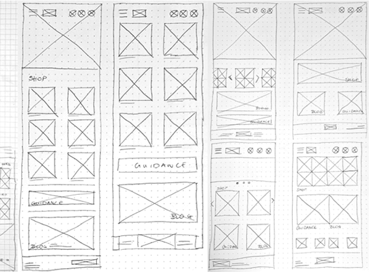
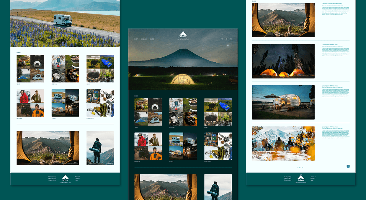
My goal was to create a website that is easy to use with an interesting homepage. That is why I chose a design with a hero image and underneath the shop categories with the most bought items in the shop.
I conducted user interviews, which I then turned into empathy maps to better understand the target user and their needs. I discovered that many users need guidance to find the camping products that they need, because there are too many products to choose from. Many online camping supply store do not have said guidance system and some are not accessible to users with visual impairment.
PAIN POINTS
Online camping supply stores often have a big product range, and no help what to buy besides product descriptions.
1
Camping supply store website designs are often busy, which results in confusing navigation.
Camping supply store websites don’t provide an engaging browsing experience and are not always accessible.
2
3
Personas
Felix is a first time camper who needs help choosing the right camping gear for him
because he does not know much about camping.
Isabelle is a mother who needs to find camping gear for children because she wants to take her two toddlers on their first camping trip.
Hans is a retiree who needs help finding camping gear because she wants to enjoy his retirement with his wife camping and enjoying the world.
Nadine is a rock climber who needs to find light and robust camping gear because she wants to go camping in the mountains.
USER JOURNEY MAP
User Research
Prototyping
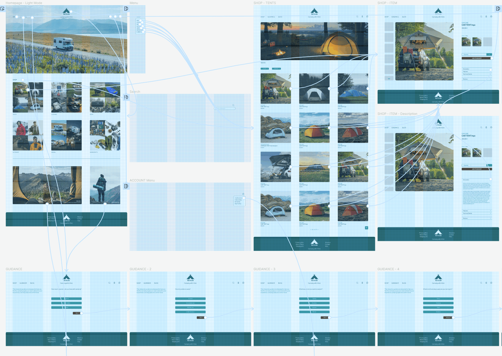
LoFi Prototype


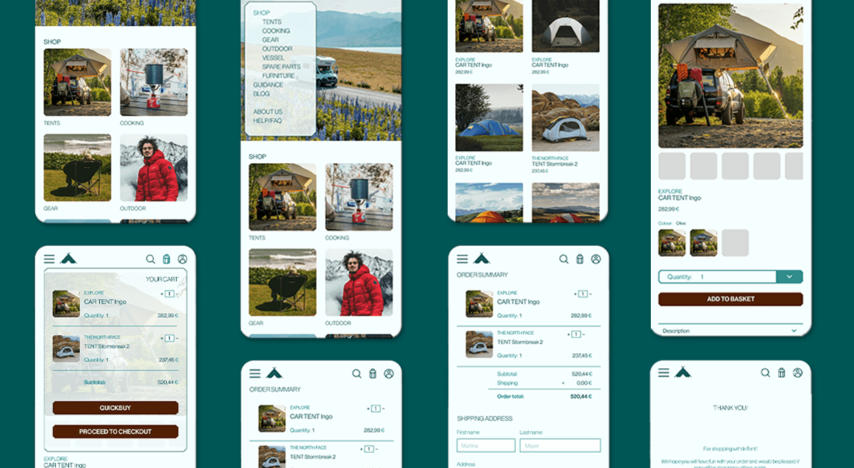
Hifi Prototype

InTent

2024
Rolle: UX-Research, UX-/UI-Design
Projekttyp: Projekt im Google UX Kurs
Dauer: 1 Monat
InTent is an online camping supply store. The users are from all ages and genders, and are outdoor and/or camping enthusiasts. InTent’s goal is to make shopping for camping supply easy and accessible to all age groups and camping experience levels.
Digital Wireframes
Hamburger menu to save space
Short menu to simplify navigation
Shop categories with most liked items to easy find category
Shop categories with most liked items to easy find category
Blog and guidance system at the end to have a second option to open them
Blog and guidance system at the end to have a second option to open them
Uncluttered homepage to not feel overwhelmed
Low Fidelity Prototype
Usability Study
Unmoderated usability study
20-30min
1
The guidance system was not linked from the homepage of the mobile version.
Users did not find the account page, because there is only an icon and no text description.
Germany, remote
5 participants
2
3
The blog was not linked on any page.
Mockups
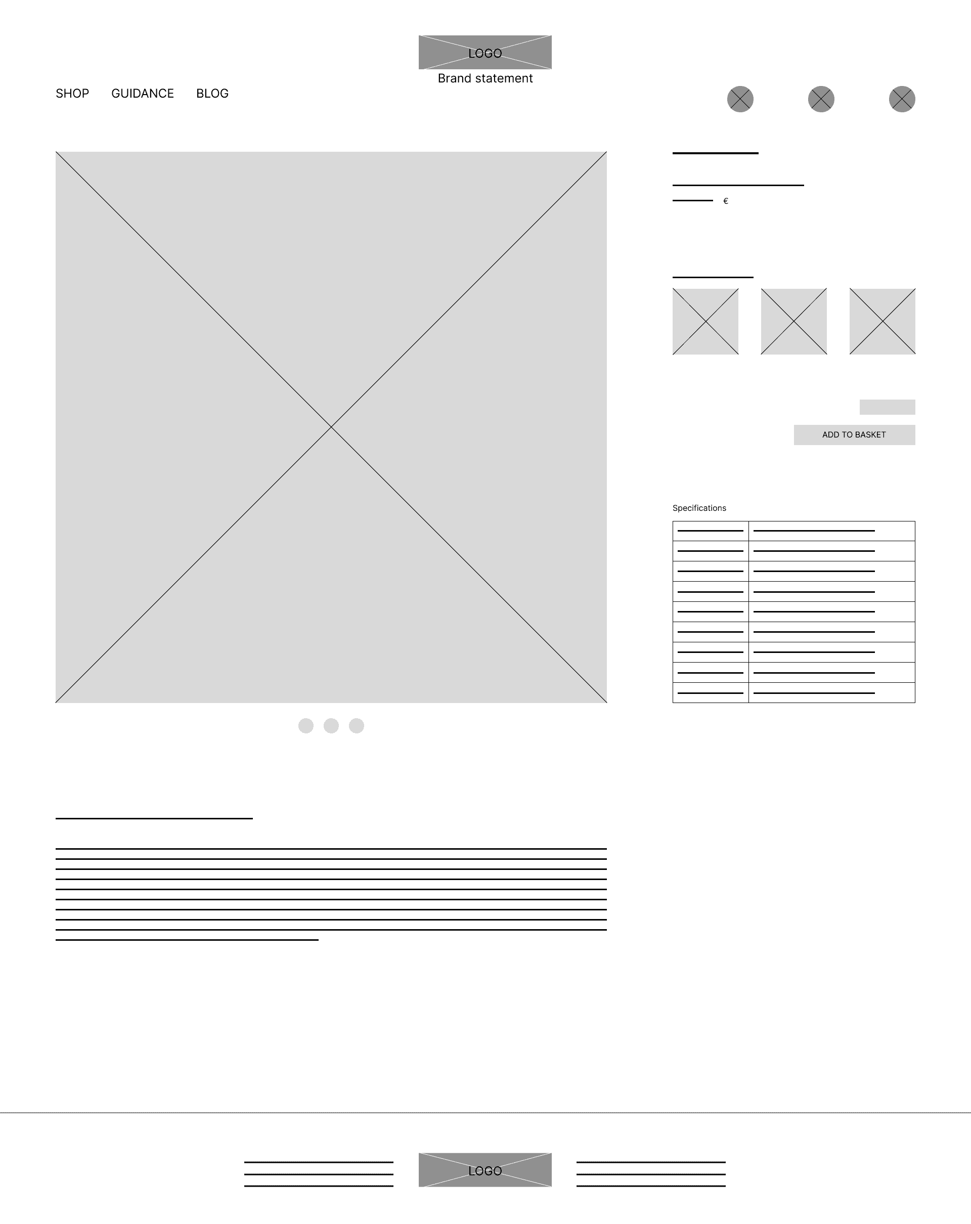
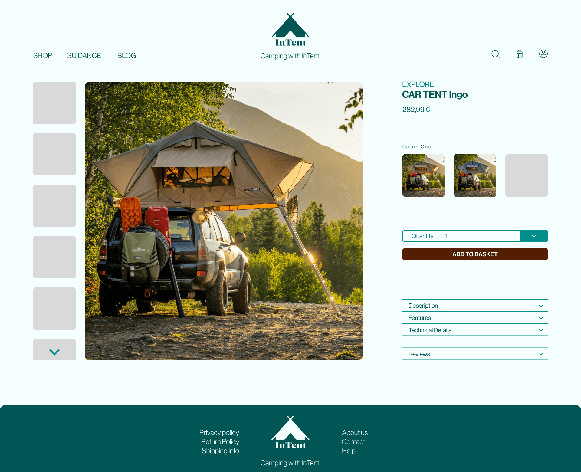
Based on the usability study I made a few changes to the product item page. To make the product item page more clearly arranged, I hid the description inside a drop down menu, only to show when clicked. I also made the “add to basket”-button more prominent to make the buying process easier.


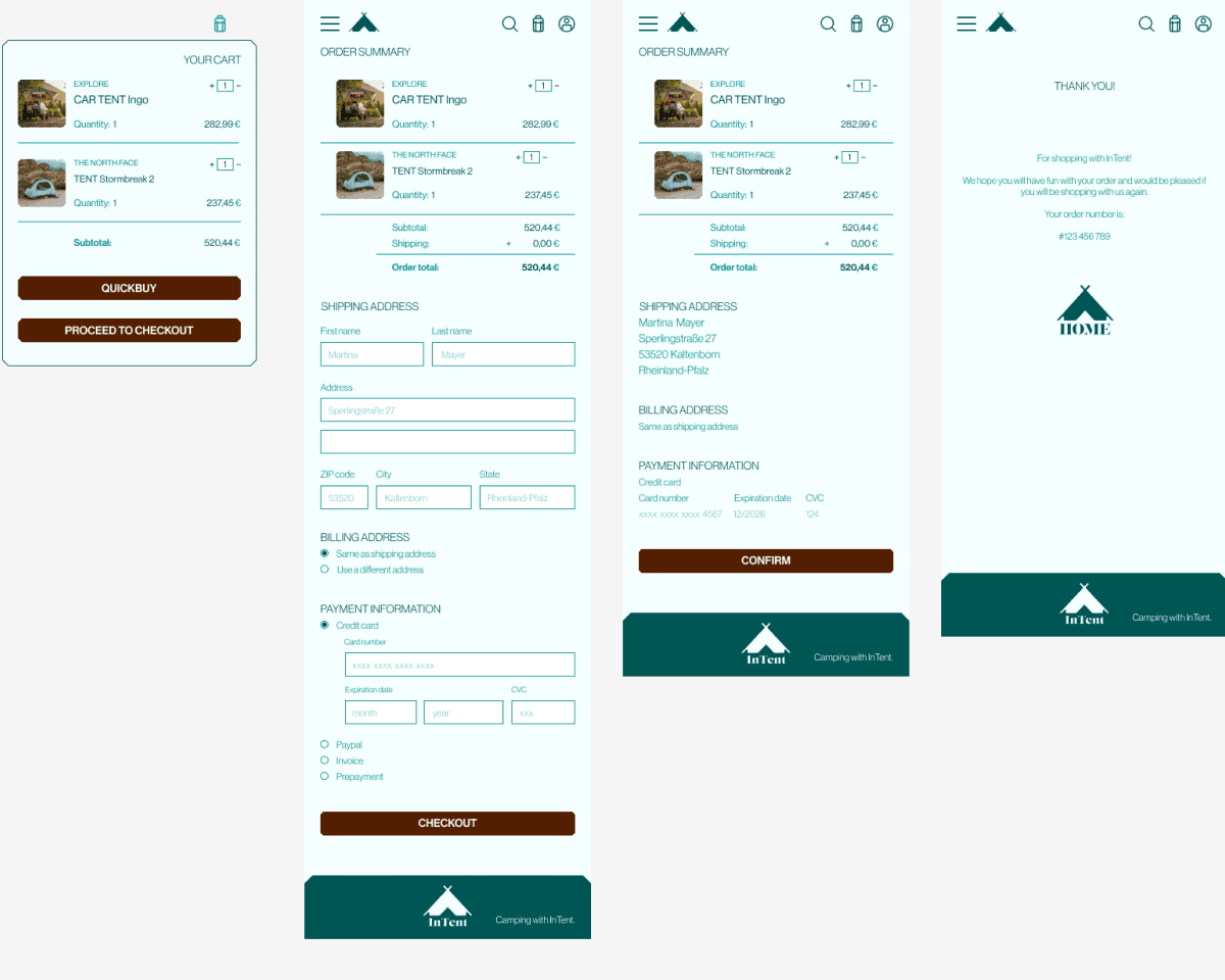
To reduce the pages in the main user flow, I streamlined the check out process and condensed two pages into one. That also gave the user an overview over the items they are purchasing, while they are in the check out process. I also gave the option to use a different address for shipping and billing.
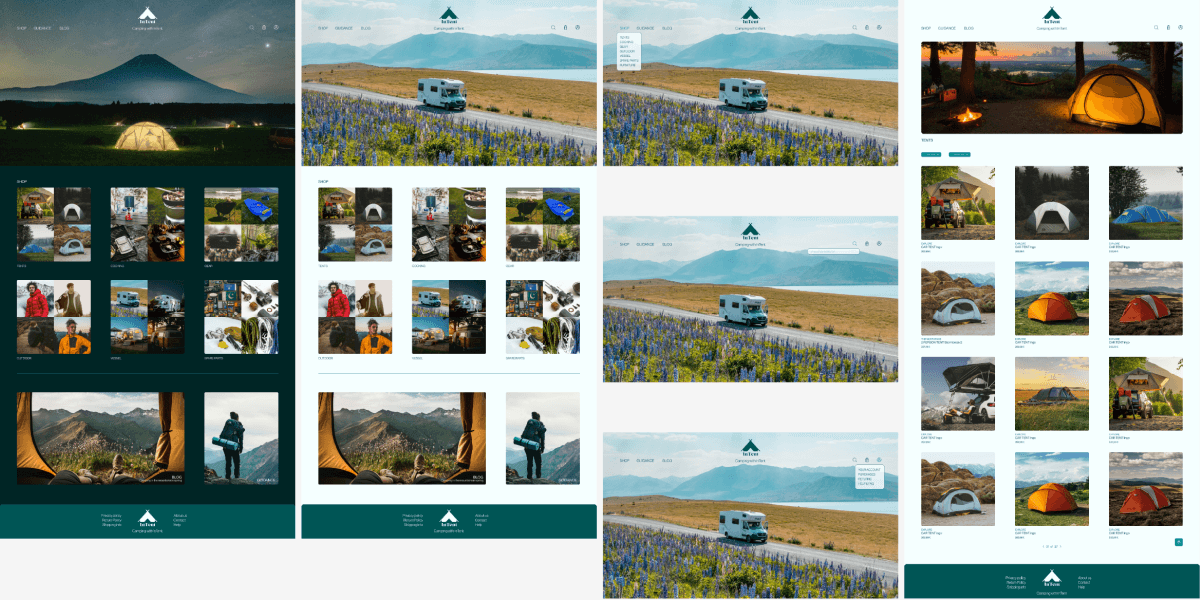

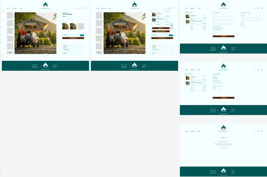

High Fidelity Prototype


ACCEssibility
Considerations
3
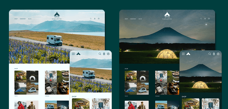
There is a light mode and a dark mode.
1
2
I used a colour contrast above 4.5 to ensure good visibility.
I used headings with different sized text for clear visual hierarchy.
Takeaways
I learned that using overlays can drastically reduce the amount of pages and make the user flow more smooth and shorter. Also making buttons and import features more prominent can also make a huge impact on the user flow. In addition adding hovering text on any icon improves the user flow for inexperienced users.